
When building your website, there’s a lot of things you have to plan for. These can range from technical tasks to more creative endeavors like selecting a color scheme, and in this case, choosing the right fonts.
But, with the thousands of fonts out there, you’re probably wondering which is the best one to use for your website. Well, you’re in luck, because we’re here to help you do just that.
Given the wide variety of fonts, it was challenging to limit this selection to just 15 fonts, but we’ve gathered the best of the best for you to choose from.
1. Cambria
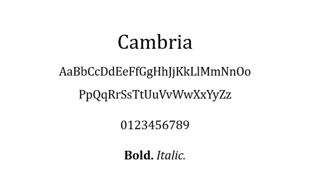
With very consistent spacing and proportions, Cambria was made for excellent on-screen reading, even when displayed in small sizes. You’ll find four different styles of this font: regular, bold, italic, and italic bold.
Because of the horizontal serifs in this font, which strongly emphasize the ends of each stroke, it is very readable.
The versatility of this font is another thing you’ll notice. The font can be used for body text, titles, and headers by combining its various styles.
2. Arial

Having a modern aesthetic, Arial is a multipurpose sans-serif font. The thick and solid construction of each letter creates a simple, modern appearance.
Because Arial can be read at any size, it has become a standard screen font. It’s even become the default font for Google Docs. On top of that, this font is widely used in printed materials like advertisements and newspapers.
Arial is a fantastic option if you’re not looking for anything big or fancy and just want to go for a traditional font that’ll work well on most websites.
3. Verdana

Verdana is a great on-screen font because it can be read in small print and on screens with low resolution. This is mainly because of the characters’ wide spacing and width.
This typeface is not just for use in on-screen typography, though. For instance, the well-known furniture company IKEA uses Verdana for both its printed catalogs and website.
If you’re looking for an HTML font with excellent readability, this font is a fantastic option.
4. Perpetua

Perpetua is formal, timeless, and refined. An English sculptor who was inspired by memorial lettering and monuments developed the font for the British Monotype Corporation.
Even more, is that the qualities of this font inspired the University of Pennsylvania and Penguin Classics to use Perpetua in their publications.
Overall, this font is very useful for educational or informational pages and websites.
5. Brush Script

If you’re looking for something both informal and casual, then Brush Script is a great modern-looking script font. It has a calligraphy design that is based on writing methods. That’s why Brush Script MT makes for a stunning yet readable display font for your website.
On top of that, this font works well for pop-up newsletters and landing pages on websites. Considering the nature of its components, it’s best to use this font sparingly and in large sizes.
6. Monaco
If you’re trying to look for a font used by the Xcode and Terminal applications on macOS X, then Monaco is the one you’re looking for. It features a pixelated and emphasized design which makes it stand out.
Monaco looks best when used as decorative text on website layouts devoted to coding or gaming because of its unique design.
7. Candara
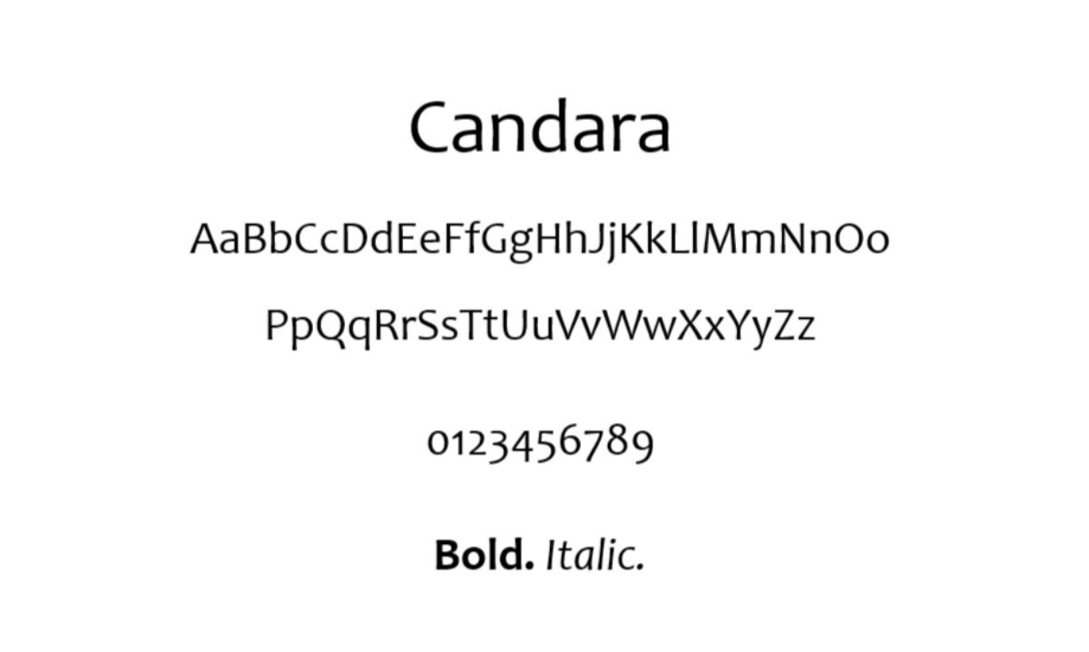
The Microsoft Vista operating system introduced Candara to the public for the first time in order to enhance LCD display readability. This typeface is ideal for displays because of how readable it is and how generously spaced the characters are.
Also, Candara has a great modern appearance because of its open forms and curves. This makes it great for casual typographic settings like blog post titles and website taglines.
8. Courier

The most well-known slab serif font is Courier, which is included with all operating systems. Screenplays for movies have also used this HTML font as a standard.
That being said, you should strongly consider including Courier in your site design if your website has anything to do with movies. But, it’s best to use this font only for headers and titles because it is categorized as decorative.
9. Geneva

Geneva’s uniform width, spacing, and length give it a crisp, contemporary appearance.
Both display and body text frequently use this font because of its flexibility. This font is readable at any size thanks to its classical style and thin strokes; it also provides generous spacing and a range of line lengths to ensure readability.
10. Arial Narrow

Of the 38 variations in the Arial font family, Arial Narrow is one of them. This typeface has a much more streamlined design which makes it more unique compared to the original. Little space separates the letters, making them appear condensed and narrow. Because of this, Arial Narrow is a fantastic option for simple websites.
If you want to pair other fonts with Arial Narrow, bolder sans-serif typefaces like Verdana and Geneva are fantastic choices.
11. Optima

Optima draws inspiration from the capital letters of ancient Rome. With its wide spacing and symmetrical strokes, it is used to convey elegance. What’s also great is that you can choose to specify the distance between each character. Even though all spacing options are readable, widening the spacing will better match this font.
As seen in the logos of upscale companies like Marks and Spencer, and Estée Lauder, Optima is best for display usage.
12. Calibri

One common and well-liked typeface is Calibri. It is the default font for a number of well-known programs, including the Microsoft Office package and Google Docs. Due to its rounded edges and straightforward design, this font primarily conveys a modern and cozy feeling.
Calibri also functions well in a wide range of text sizes. This makes it suitable for digital and screen displays and is very readable.
With its simple design, it can be pretty much used for any website.
13. Garamond

If you’re looking for an old-style serif font, then Garamond is the perfect fit. It’s a traditional font style that is frequently used in print and digital displays, such as Harry Potter books, the Google logo, and Dr. Seuss’s book series.
This font is ideal for giving your website a vintage yet classic feel.
14. Didot

Neoclassical font Didot has a traditional design with a contemporary twist. If you need a display font for the headings, taglines, or titles on your website, then this is a great choice. Because of its high contrast and added stress, this typeface is renowned for standing out.
What’s more, the Late Show with Stephen Colbert and CBS News both use the distinctive font.
15. Playfair Display

The serif font Playfair Display has a pleasantly modern vibe with a hint of femininity.
This typeface is the ideal choice for websites that cater to women. The weight of a font is inversely correlated to how aesthetically pleasing it is. In other words, the lighter the font, the more pleasing it is to look at by design.
What Are The Main Types Of Fonts?
Designing your website with the best font is like choosing the perfect color to paint your home. The new coat will refresh your home and reveal a lot about the people who live there, so you want to get it just right. A house with peeling paint indicates neglect, while one with glossy, vibrant colors shows good maintenance.
Similarly, just like colors do for a house, fonts are used to evoke particular emotions and forge special associations in the mind with a particular brand. When designing a website, you should consider the advantages, disadvantages, and psychological connotations of each type of font.
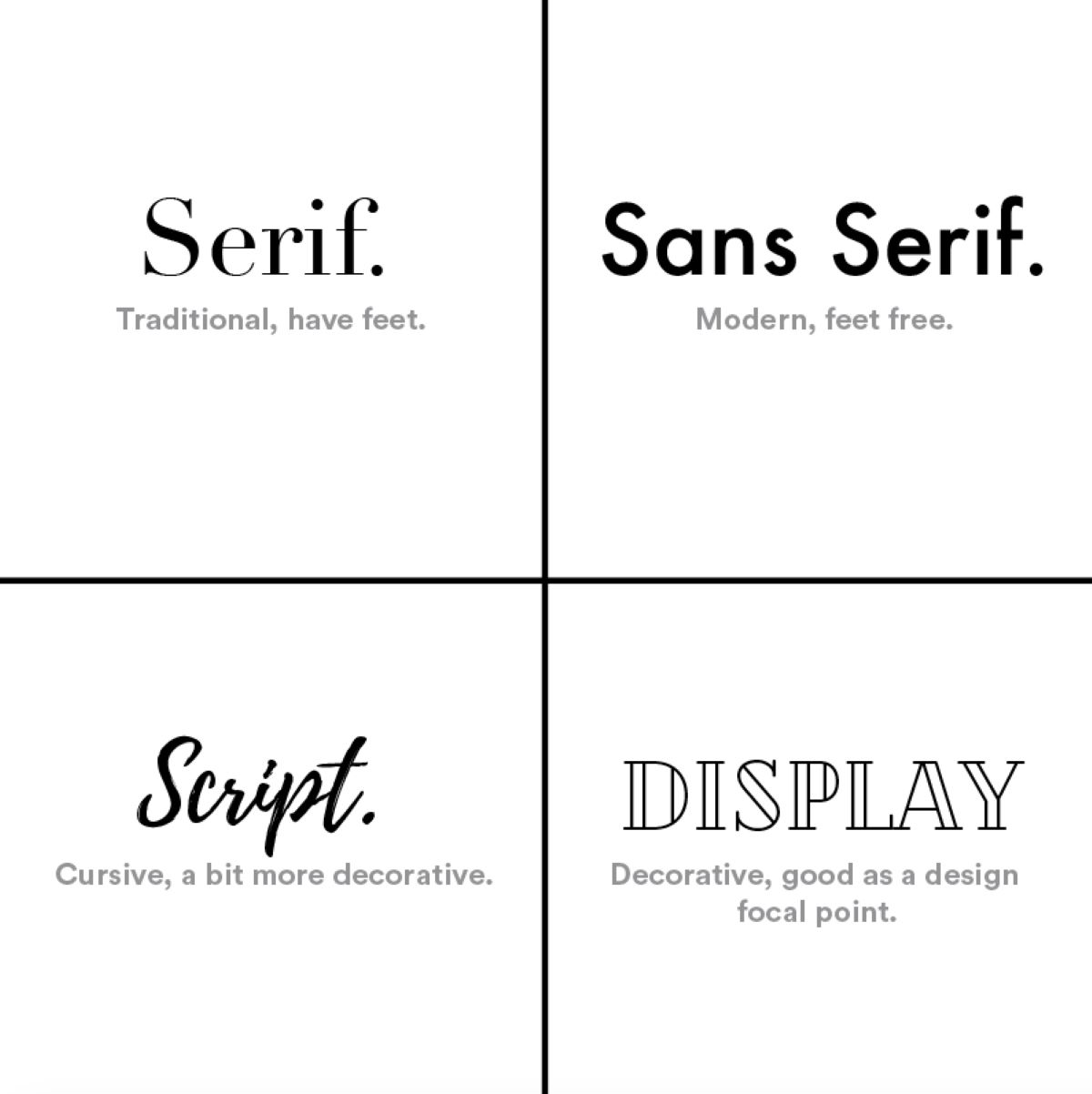
There are four primary font types, and each one is linked to a different emotion. It’s crucial that the font you choose supports the goal of your website, just like it does with every other component. The following are the four different font families and what they convey:
- Serif If you want to project a sophisticated and elegant brand, serif fonts are a great and popular option to choose from. They give your website a traditional, respectable, and dependable vibe.
- Sans-serif These fonts provide a straightforward, tidy appearance. Because of their elegant and effective design, they can be bold and used as attention-getters while still emphasizing clarity and a forward-thinking approach. Websites that choose this font family place a high value on honesty and sensibility that don’t require anything fancy or unnecessary.
- Script Typically, script fonts appear in the form of femininity, creativity, elegance, and freedom. They convey a more hands-on, individual approach to websites through their curved and flourished styles. Using script fonts effectively can help websites express a sense of “personal touch” and artistic thought.
- Display These fonts tend to emphasize originality and convey uniqueness. On top of that, because of their adaptability, websites can combine and contrast various font styles to choose which emotions to emphasize. A sense of fun, casual and creative thought are some of the most frequent feelings evoked by display fonts.
With that said, make sure the fonts you choose for your website are aesthetically pleasing and unique to you. This is to effectively represent your brand across all platforms and browsers.
Luckily, with website builders, they make it simple even for beginners to apply fonts on your website. Pretty much anyone can design a website nowadays thanks to the help of simple features such as drag-and-drop functionality. With just a few clicks, the best web hosts also make it very easy to set up a website.
Does Web Font Choice Matter?
They say a first impression is hard to take back, and fonts on your website already reveal a lot about you. Because it’s one of the first things your visitors will notice when they arrive, the font on your website can actually have an impact on whether visitors decide to stay or leave.
A wrong font choice may give your website a cheap, unprofessional appearance, which will reflect poorly on your business.
The ideal fonts are readable, fashionable, and supportive of your brand identity. But while picking a font that expresses your personality and brand identity is a good idea, you should also avoid going overboard with cutesy or intricate designs too. For instance, things such as an overly stylized font can make it difficult to read your text, potentially frustrating your audience and causing them to click out of your site.
Now that you’re aware of some dos and don’ts, let’s get into some font styles, shall we?
Font Styles Are An Important Part Of Your Site Identity!
A crucial part of any brand identity is selecting the right font. The ideal one can help you more effectively communicate your company’s values and objectives by adding new layers of symbolism to your brand.
However, always keep in mind how each font style and typeface supports the look and feel of your brand. Your brand can tell your company’s story the way it was intended to be told by finding the right combination of types and design elements.
So, now that you know the best fonts to use, go forth and design the perfect website!
Follow Bitcatcha for more website-related tips.