
Website management is an important strategy to ensure your site performs optimally, remains secure, and meets the changing needs of its users in the long-term. This article outlines the 8 steps to managing a website. We explain its importance, how to implement it, and the website management tools to help get the job done.
This guide benefits any small business owner, hobbyist, and enterprise with an online presence. Let’s begin.

What Is Website Management?
Website management is an ongoing process of maintaining and optimizing a website to ensure performance, functionality and security. This involves tasks like content updates, managing your CMS (Content Management System), website design tweaks, and monitoring website analytics. It also includes installing the latest security updates and patches, managing hosting environments, and implementing backup and recovery procedures.
What Is the Importance of Website Management?
The importance of website management is that it ensures optimal performance, user satisfaction and security on a long-term basis. The goal of website management is essentially to keep a website running smoothly and up-to-date whilst empowering you to take advantage of potential growth opportunities as they arise. Taking proactive measures against potential security threats and taking regular backups also further ensures the longevity of your site as you work towards your goals.
What Indicates a Poorly Managed Website?
There are 5 indicators of a poorly managed website. The first is an expired domain name, which makes the website temporarily unavailable. The second is inconsistent website design, characterized by mismatched fonts, colors, or layout styles across different pages. The third is slow website performance, often caused by unoptimized images, bloated code, or inadequate hosting solutions. The fourth is broken web pages like links that lead to non-existent pages (404 errors) or images that won’t load. The fifth is outdated content that reduces a site’s credibility.
What Are the 8 Steps to Manage a Website?
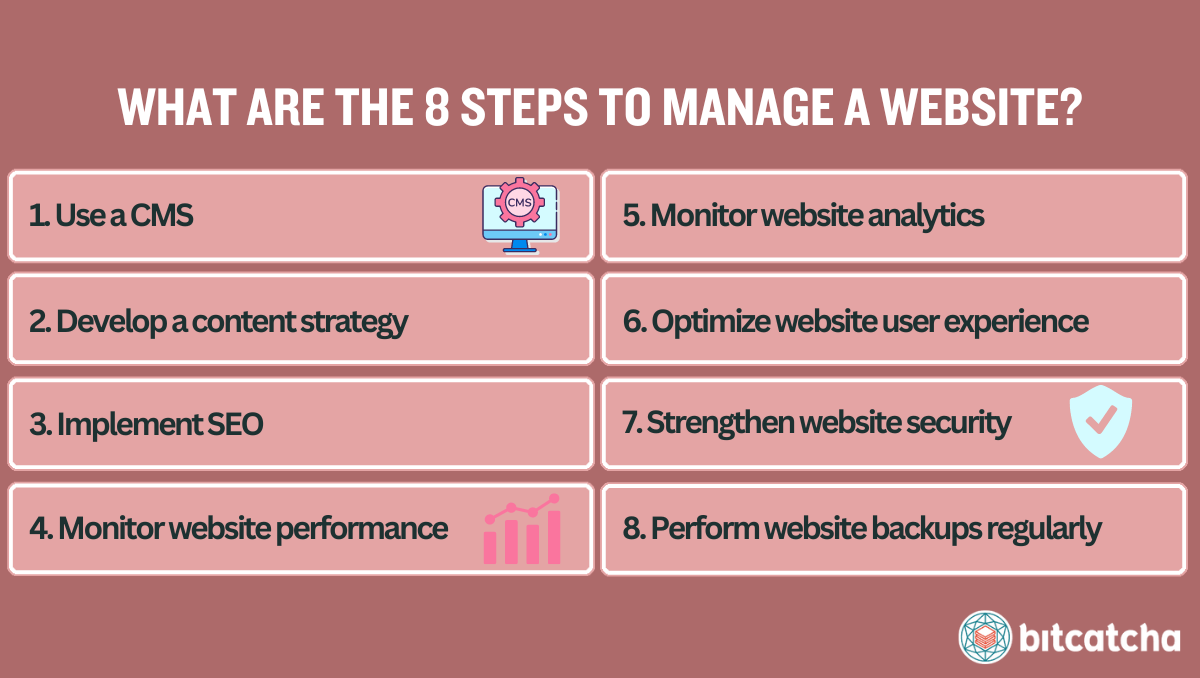
There are 8 steps to manage a website :
- Use a content management system
- Develop a content strategy
- Implement search engine optimization
- Monitor website performance
- Monitor website analytics
- Optimize website user experience
- Strengthen website security
- Perform website backups regularly
1. Use a Content Management System
The first step is to use a content management system (CMS) when building your website. A CMS is a software tool that allows users to create, manage, and modify content on a website without the need for specialized technical knowledge. Popular CMSs include WordPress, Joomla and Drupal.
Using a CMS to manage a website drastically simplifies the process of updating website design and content. It enables the convenient publication, editing, and management of website content. A CMS also supports the management of website functionalities through themes and plugins, which enhance the website’s capabilities and user experience.
2. Develop a Content Strategy
The second step is to develop a content strategy. A content strategy is a plan and approach for creating, publishing, and managing content over time. It aims to meet specific business objectives and satisfy the needs of a target audience.
Formulating a content strategy is crucial for determining the type, format, and frequency of the content to be published. This approach guides the update and publication cycles, and ensures that content stays relevant and engaging.
Developing a smart content strategy ensures all the content you produce aligns with your business goals and the needs of your target market. Business goals include increasing brand awareness, boosting sales, and increasing engagement.
3. Implement Search Engine Optimization
The third step is to implement search engine optimization (SEO). SEO is the practice of enhancing a website’s content and structure to improve its position in search engine results. This improves organic search visibility and your website becomes more accessible to users searching for relevant information. This increases organic traffic.
To implement SEO, begin with keyword research to understand the terms your audience uses and their search intent. This helps in crafting content that aligns with user searches. Then, incorporate internal links within your content. This helps search engines understand your site’s structure and the relevance of pages. Building external links from reputable sites also elevates your site authority and rankings.
SEO must seamlessly integrate into your overall content strategy. It must influence how you plan, create, and format content to maximize visibility in search engines. Utilize market-leading SEO tools include Ahrefs, SEMrush, Google Trends and Google Search Console to enhance your SEO execution.
4. Monitor Website Performance
The fourth step is to monitor website performance. Website performance measures the efficiency of a website in terms of speed, responsiveness, and reliability during user interactions. Website performance is important for delivering a positive user experience to visitors. It’s also important because search engines also prioritize faster websites in their rankings.
There are 3 common website performance metrics to monitor. The first is page load time which is the duration it takes for a webpage to become fully interactive and functional. The second is Time-to-First-Byte (TTFB). This is a gauge of server speed and measures the time from the user’s request to the moment the first byte of response is received from the server. The third is uptime which tracks the proportion of time a website is available.
There are 3 ways to optimize website performance. The first is to opt for a fast web hosting service. The second is to implement a content delivery network (CDN). CDNs help in delivering content efficiently from the closest server to the user which speeds up page loads. The third is to maintain lightweight web pages by limiting the use of large images and heavy scripts.
Use tools like PageSpeed Insights, WebPageTest, and UptimeRobot to monitor and analyze website performance. Regular collection and analysis of these performance metrics allows you to make targeted improvements.
5. Monitor Website Analytics
The fifth step is to monitor website analytics. Website analytics involves the collection, measurement, and analysis of web data to understand and optimize the user experience. This discipline provides insights into how visitors interact with a website, as it tracks their activities and behaviors during their visits. Website analytics thus help you identify what works and what doesn’t on your site.
Ensure you are monitoring 5 common website analytic metrics. The first is traffic volume, which measures the number of visitors to your site. This gauges popularity and reach. The second metric is traffic source, which identifies where visitors are coming from. This includes search engines, direct visits, referrals from other sites, and social media platforms. The third metric is bounce rate, which indicates the percentage of visitors who leave the site after viewing only one page. The fourth metric is time on page, which provides insights into how long visitors stay on specific pages. This helps assess content effectiveness. The fifth metric is conversion rate, which tracks how well your site converts visitors into action-takers, like subscribers, customers, or clients, depending on your goals.
Use website analytic tools like Google Analytics, SimilarWeb, Microsoft Clarity, and Hotjar.
Collecting and analyzing this data is essential for user experience optimization.
6. Optimize Website User Experience
The sixth step is to optimize website user experience. Website user experience (UX) refers to the overall experience of a user when interacting with a website. It examines how easy, enjoyable, and effective it is for users to achieve their desired outcomes. It’s important to optimize user experience in order to optimize your site conversions. A positive UX increases the likelihood of visitors making purchases, signing up for newsletters, or contacting customer service.
It’s important to pay extra attention to the mobile experience given the increasing prevalence of mobile internet usage. Ensure that your website is responsive and provides a seamless experience on smartphones and tablets for better accessibility and user satisfaction.
There are 4 ways to enhance website user experience. The first is to speed up page loading. The second way is to ensure consistent design and branding across all pages. The third way is to improve website navigation by utilizing clear navigation aids like header menus, footer links, and sidebars. The fourth way is to increase accessibility for all users. This involves adhering to web accessibility standards, such as those provided by the Web Content Accessibility Guidelines (WCAG).
7. Strengthen Website Security
The seventh step is to strengthen website security. Website security refers to the measures taken to protect a website and its data from cyber threats, including malware, unauthorized access, attacks, and data theft.
There are 4 ways to secure your site. The first is to install a firewall to filter out malicious traffic and prevent unauthorized access. The second is to install Secure Socket Layer (SSL) certificates to protect data transmitted between your website and its users. The third is to use website security plugins. The fourth is to use strong, complex passwords for all user accounts associated with your website.
8. Perform Website Backups Regularly
The eighth step is to perform website backups regularly. A website backup involves creating a complete copy of a website’s data, including files, databases, and configurations. This copy is stored securely. Website backups are important in that they allow users to restore the website to a previous error-free state in the event of data loss or corruption.
There are 3 methods to backup your site. The first is with your web hosting control panel. The second is via your CMS’ built-in backup tool. The third is via File Transfer Protocol (FTP). Methods 1 and 2 allow you to automate your website backups via backup scheduling.
Does Website Management Vary by Website Type?
Yes, website management varies by website type because each type has different components, features, and functionalities. For example, eCommerce website types need to focus on secure transactions, inventory management and maintaining trust. Informational website types need to prioritize content updates, publication schedules, and SEO. The different components and goals of these different website types require different website management steps.
What Are the Must-Have Website Management Tools?
There are 9 must-have website management tools:
- Content Management System (CMS)
- AI Tools
- Sitemap Generator
- Website Speed Test Tools
- Responsive Website Template
- Web Hosting Control Panel
- VPN (Virtual Private Network)
- Password Manager
- Cloud Storage
What Are the Commonly Used CMS for Websites?
There are 5 commonly used CMS for websites by market share according to W3Techs. Firstly, WordPress holds 62.7% of the market share. Secondly, Shopify accounts for 6.4%. Thirdly, Wix has a 3.9% market share. Fourthly, Joomla represents 3.0%. Lastly, Drupal holds 1.4% of the market.
We compare these popular CMS options in depth in our comprehensive guide.
Can Using WordPress Make Managing Websites Easier?
Yes, using WordPress can make managing websites easier because its features cover all areas of website management. There are 4 management areas WordPress particularly excels at. The first area is easy website creation without use of code. The second area is content publishing and editing. The third area is user management through setting customizable roles and permissions. The fourth area is extending a website’s functionality via large theme and plugin directories. Check our guide on how to manage a WordPress site for more easy tips.
Can I Use AI Tools to Produce Website Content?
Yes, you can use AI tools to produce website content. ChatGPT and Claude are excellent for text-based content creation, including ideation, copywriting, and even content structuring. They help generate blog posts, product descriptions, and marketing copy. MidJourney and DALL-E are recommended for visual content. Such generative AI technologies have advanced significantly and are now capable of assisting in various aspects of creating website content.
What Is the Purpose of A Sitemap?
The purpose of a sitemap is to make it easier for search engines to crawl your website. A sitemap is a file where you’re able to list the web pages of your site to tell search engines about the organization of your site content. It acts as a map of your website, and shows the structure of your pages, their relationships, and how they are linked. This in turn helps with SEO efforts, as it ensures that your content is more readily found and ranked by search engines like Google.
Does Running Website Speed Test Slow Down My Website?
No, running website speed tests does not slow down your website. Website speed tests are designed to simulate how quickly your website loads from different locations and under various conditions. They do not interfere with the actual performance of your website for your visitors.
The results from these tests provide diagnostics that help you identify elements of your website that are slowing it down and make targeted improvements to enhance site speed. See our guide on speeding up your website for actionable insights.
Where Can I Find a Responsive Website Template?
You can find responsive website templates from the template libraries of hosting or website builder providers. W3Schools also offers a variety of free responsive website templates designed to be straightforward and easy to customize.
What Can Web Hosting Control Panels Do?
A web hosting control panel can simplify the management of web hosting services and server functions. A web hosting control panel is a user-friendly interface provided by web hosting companies that eliminates the need for complex command line management.
There are 5 functions of web hosting control panels. The first function is domain management. Web hosting control panels allow users to manage domain settings, including transferring domains, setting up subdomains, and managing DNS settings. The second is email account configuration. Such control panels let users manage email accounts associated with their domain, set up email forwards, and configure spam filters. The third is file management. Web hosting control panels let users upload, delete, and edit files on their server, use a file manager, and set up FTP accounts. The fourth is database management. The fifth is to allow management of security features like SSL/TLS manager, IP blockers, and malware scanners.
Useful web hosting control panels like cPanel, Plesk or custom control panels are included for free in the plans of the leading web hosting companies.
Is Using Public WiFi Unsafe for Managing Websites?
Yes, using public WiFi is unsafe for managing websites due to the lack of encryption. This means that the data transmitted over these networks (e.g. login credentials, sensitive information) is at risk of interception by cybercriminals. Ensure you use an excellent VPN tool if you find yourself in a situation where you must use public WiFi to manage your website. A VPN (Virtual Private Network) is a security tool that encrypts your internet connection.
Where Can I Keep My Website Passwords?
You can keep your website passwords in a password manager. Password managers are specialized tools designed to store and manage your website admin passwords in an encrypted format. Ensure you use a reputable password manager to benefit from advanced encryption algorithms and features like password-generation.
When Should I Back up My Website?
You should back up your website on a daily, weekly or monthly basis depending on how often your site is updated. Daily backups are ideal if your website frequently updates its content or if it handles transactions. It’s important to also back up your website before committing major changes to your website. This includes updates to themes, plugins, and software.
Where Should I Keep My Website Backups?
You should keep your website backups in 2 different types of media, with one copy kept off-site. This is known as the 3-2-1 backup strategy. Store two copies of your backups on different types of media (e.g. your local machine and an external storage device). Then keep one additional copy of your website backup off-site to safeguard against local disasters. The most convenient and secure way to manage off-site backups is to use cloud storage.